KibiKibi is a clean-label food brand reinventing everyday snacking with fun, flavorful formulations made for modern, health-conscious consumers.
/The Challenge
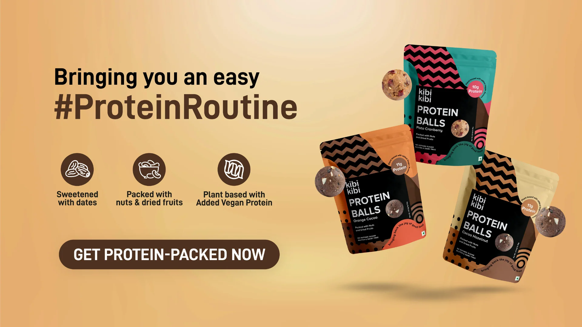
Entering the granola category meant navigating a landscape dominated by either overly childish, cereal-style visuals or exaggerated food imagery that rarely communicates true health value. While KibiKibi already had a strong brand language, the task was to evolve it—creating a design that felt unmistakably KibiKibi yet distinct for this new Super Granola range. The biggest hurdle: clearly communicating health benefits, ingredients, and transparency without losing shelf appeal or emotional pull.
100
New customers gained within the first month of launch
78%
Repeat orders for the new Super Granola variants
1,000+
People engaged with the product at offline launch events
/The Solution
We approached the packaging by putting clarity, transparency, and appetite appeal at the center. The front-of-pack prioritizes what matters most to health-conscious buyers—fiber, protein, clean ingredients, and sugar levels—paired with a transparent window to showcase the product itself.
Each variant—Chunky Chocolate, Banana Cinnamon, and Classic Fruit & Nut—received its own instantly recognizable color palette to trigger flavor association without needing to read text.
On the back, we implemented a structured storytelling layout: a clean ingredient narrative, an easy-to-scan nutritional table, and recommended ways to enjoy the granola. This balance of honesty and vibrancy ensured the pack popped both on shelves and online, aligning perfectly with KibiKibi’s playful yet serious commitment to healthy food.

/The Result
We approached the packaging by putting clarity, transparency, and appetite appeal at the center. The front-of-pack prioritizes what matters most to health-conscious buyers—fiber, protein, clean ingredients, and sugar levels—paired with a transparent window to showcase the product itself.
Each variant—Chunky Chocolate, Banana Cinnamon, and Classic Fruit & Nut—received its own instantly recognizable color palette to trigger flavor association without needing to read text.
On the back, we implemented a structured storytelling layout: a clean ingredient narrative, an easy-to-scan nutritional table, and recommended ways to enjoy the granola. This balance of honesty and vibrancy ensured the pack popped both on shelves and online, aligning perfectly with KibiKibi’s playful yet serious commitment to healthy food.
/Client Feedback
The Conversion Lab didn't just redesign our website—they helped us articulate who we are as a brand. Every detail, from the storytelling to the visual experience, felt intentional and aligned with our vision. The result is a digital presence that truly reflects the quality of our work.
— Team
Kibi Kibi


Start your Project
